CategoryAnalytics

How to quickly format retention data in less than 5 minutes to maximize learning

Formatting a retention data set is critical whether it’s for yourself or in a situation like a job interview. Once you’ve asked all of the questions necessary to understand the data set, you should format it to maximize your ability to analyze it. Here’s my step by step process:

Export the raw data from your analytics system

It should look like the below. The cohorts are in the first column, the size is next, and then the number from the original cohort that retained in each subsequent period.

retention-1

Create another table that computes the percentage values of the original cohort size

retention-1

Add a conditional formatting element to show the size of the cohorts over time (conditional formatting -> data bars)

retention-4

Apply conditional formatting to the table that contains the percentages. It should now look like this:

retention-3

Adding summary rows

Then I create two new rows at the bottom of the percentage table. The first is the average of each column, and the second is the percentage decrease for each additional week.

retenion-5

retention-6

Wrap it up

Now you have a nicely formatted retention table that shows you:

  1. The size in cohorts over time
  2. At a glance how your cohorts retain over time
  3. Where there are good pockets and bad pockets of retention
  4. The average of cohort retention over time
  5. Which weeks have the biggest drops in retention
  6. Whether your retention levels off over the long term

Where there are many more graphs you could create off of this data set, I think this sets the right foundation for how to quickly look at the data and answer some important questions.
Are there other ways you visualize this information? Do you recommend doing this another way or formatting it differently? Let me know in the comments below.
Disclaimer: all of the data in these screenshots was made up for this example.

The Retention Questions You Should Be Asking in a Job Interview

In my experience, job applicants rarely ask the right questions when faced with a retention exercise. You can create a retention chart for anything, but I think these are the questions you simply have to ask:

  1. What do the cohorts measure?
  2. What is the criteria for retention (the % of the cohort that returns)?
  3. How can I segment the retention data?

There are many follow up questions you should be asking based on the answer.

Question 1: What do the cohorts measure?

  • Is it any People? Companies? Revenue? People using it at a company? Is it a subset of any of those concepts?
  • If it’s people — what kind of people? Is it people who did some action? Example: is it people who signed up for a product? Is it people who saw some value from your product? Bought a product? What is the trend of the cohorts over time? What could affect that? How do you expect the numbers to change over time?

Question 2: What is the criteria for retention?

  • How is retention measured? If it’s people, what action do they need to take to be counted as having been retained? Why was that chosen? Why is it important?
  • If it’s revenue, how is it measured?
  • If it’s an attribute of a person or a company (maybe number of people active), how is that measured? Why was that chosen? How is it important to the business?
  • Does it level off? If you have a budget to acquire people in the cohorts, how long must they stick around in order to sustain a profitable business?
  • How does the data change over time? Are there patterns that you would expect to see, or cliffs where things drop off?
  • Do you expect to see patterns horizontally (step function changes from one cohort to another), vertically (time barriers where cohorts worsen or improve), or diagonally (holidays, press spikes, re-engagement campaigns)?

Question 3: How can I segment the retention data?

  • Are there pockets in the data that are better or worse than the overall average?
  • Is there a feature that results in better retention?
  • Is there a platform (ex: Android, iOS) that is better than another one?
  • Is there a cohort acquisition source that performs better?
  • Is there a geography that performs better in retention?
  • Is there a cohort attribute that results in higher retention? Age / sex / profession of people? Size of company? Industry of company?

If you’re doing a retention exercise in an interview, you don’t even really need to look at the data, you could just ask questions the whole time.

Identify users with the most valuable feedback

In my time as a product manager, I was constantly reminding myself to talk to customers more. It might have been to talk about existing features, something under development, or customer pain and processes for product research. It was easy in the beginning, because we knew most of the people using the tool as we worked on the initial version. Even as we got bigger, my feelings usually boiled down to these four words: talk to customers more. I think a critical skill, however, is learning how to talk to the right customers.

As I worked on the HubSpot sales products and we grew it to hundreds of thousands of active users, I quickly realized I couldn’t speak to everyone. I needed to be strategic about who I reached out to, and the type of feedback I was looking for. It’s a dangerous path to go down, because you can end up wasting time by over-analyzing your data and getting into analysis paralysis. Even worse, in my opinion, is taking the existing feedback as representative of your user base, and only solving for the loudest segment of the customers or the customers that are most convenient to interact with.

I want to share the process that Brian Balfour showed me. It’s fairly easy (and inexpensive!) to identify who you should reach out to, and collect their feedback.

Step 1: Identify who you want to speak with

Are you working on activation? If so, you want to target people who sign up but don’t really get started or see value. If you’re working on retention, you need to dig into why someone would start to use it but end up quitting your product. Not sure which one you should be solving for? It depends.

Step 2: Find those people

Any good behavioral analytics system will allow you to look at the number of events that someone has done over time. Let’s say we want to find users who start to use the product, but then stop. Most analytics systems will tell you the raw number of times an event happened, or the unique users that did it. Here’s a sample from the Amplitude demo for when someone plays a song:

The graph above is great for evaluating trends, but the goal is to speak with individual users about their experience. You need to go a level deeper and visualize this data on an individual user level. You should be able to get it by the user’s email. Once you have that, export it to Excel so you can play with it more closely.

For the next images, imagine I exported data that has the number of events someone performed on a daily basis for my app’s most important events. I then would create a pivot table:

This pivot table has a list of email addresses in the first column, alongside the number of times an event happened per day. You could do the same on an hourly / daily / weekly / monthly basis, depending on what makes sense for your app.

Next, I typically do some more filtering to evaluate who I could speak with. I set up this filter to find the people that weren’t active on 6/18, but were active on 6/16 or 6/17. I expect people to use my app every day, and I am shocked when they don’t. I’m curious to know why they didn’t use it.

You could spend a lot of time doing this type of analysis. I’d try to limit yourself to less than thirty minutes of playing with a spreadsheet like the above. I’d bucket your search into a couple of categories:

Super active users:

  • They use the crap out of your product, consistently. I’d be curious to speak with them to understand what they like about your product and why it’s so valuable to them.

Drive by users:

  • People who check out your application quickly and then leave, never to return. What was their impression? Why didn’t they stick around? If you’re using a product like Fullstory, are you able to see what they did in your product?

Engaged people who quit

  • I’d look for people who used it for a minimum of some period (a month? Multiple weeks?) and then stopped using it. These people presumably understand at least a portion of your product, but then took action to stop using it.
  • As you can see in the screenshot, I added a column where I computed the number of days someone had performed an action. If done over weeks / months, this is helpful to quickly find the users who were long term users.

Step 3: Reach out to users

This should produce some users that you want to speak with. Now comes the fun part! I took the list of emails, and I send them an email soliciting feedback. This is where I hear a ton of complaints from product managers like “I don’t have enough people to email” or “people never click through to the survey.”

I typically get 10–20% response rates on the emails that I send out. My secret is that I send out the emails from my Gmail account. I BCC lists of users and when I contacted them so I have a record and don’t email people multiple times. This works for multiple reasons:

  1. It ends up in their inbox, not the promo inbox
  2. It feels more personal, there’s no professional email template
  3. One final key: they only have to respond to give you feedback. Nobody wants to click on a link to fill out a survey.

Here’s the email that I send out:

Nobody wants to click on a link to fill out a survey, even if it’s a one question survey. I often get back soliloquies from users with incredibly valuable feedback. I’m grateful, and I also reply back to the emails multiple times doing a typical five whys analysis. This is another reason why it’s superior to embedding a google form into an email.

Step 4: Collect / Analyze the feedback

If you choose to send out this survey to a large group of people, it’ll quickly become difficult to report off the trends and high level information. This is where I use Zapier.

I connect the Gmail and Google Docs zaps like this:

I filter the responses to the survey into a custom label so it doesn’t overload my inbox. I use Zapier to pull the responses into a Google Spreadsheet, so I can easily read them and bucket the responses:

You can see that I have manually gone through and added a feedback bucket for each of the responses. I try to bucket reasons in a handful of categories, and look for common language patterns for how people describe problems. That allows me to create reports for development teams that look like the following:

The value isn’t in doing this with free or low friction tools — the value is in the insight you get into your users and what they love or hated about your product. I’m sure that there are fancy tools that help with this type of analysis, but the bottom line is that you don’t have an excuse for not doing this type of process. It works incredibly fast, produces results, and is free (other than your existing analytics system). I like this because it gets you really close to your users and their behavior, and allows you to quickly get your hands dirty and get some actionable feedback.

How could this process be better? How do you find and the solicit feedback from the users that will have the biggest impact on your company? Let me know through a comment, or drop me an email (it’s on my personal blog).

Thanks to Magdalena Georgieva, Lars Osterberg, and Brian Balfour for reading drafts of this post.

Good vs. Bad Retention — The User and Revenue Impact

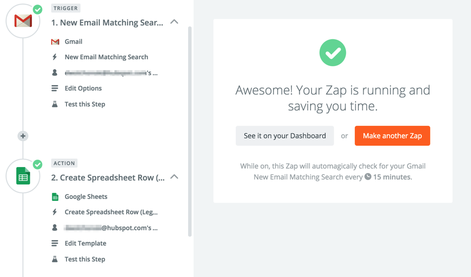
I just published this piece on Medium, but am also cross posting to my blog. If you want to make sure you receive all of the content I put out, make sure to subscribe to my email list.


There are many things that set Facebook apart from your (or my) products. That said, there’s really one thing that it all boils down to: retention. Facebook has developed a product that people use indefinitely. The rest of us? We have a long way to go. What should you be doing to close the gap? Keep track of your retention numbers.

Most of the people I speak with have no idea how many people they expect to be using their product in a year, even though they are the ones ultimately responsible for the progress. If you do have some sort of goal, did you just pick a big hairy number? Did someone throw out a goal for you? If I could give you one piece of advice, it would be to build a simple model so you know what to expect.

After watching Phil Libin’s talk on retention and cohorts, I thought it would be interesting to model out what different types of retention look like for a SaaS product. What would it look like if you acquire the same number of users over time, but don’t hang onto them? What would it look like if you had really good retention? What are the tipping points for user growth? I built a couple of simple Excel models, and the graphs were quite shocking to me.

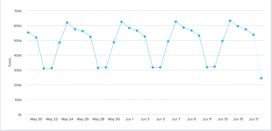
Let’s say you launch a new product, and as a good leader you track the people getting value from your product over time. Imagine it looks like this:

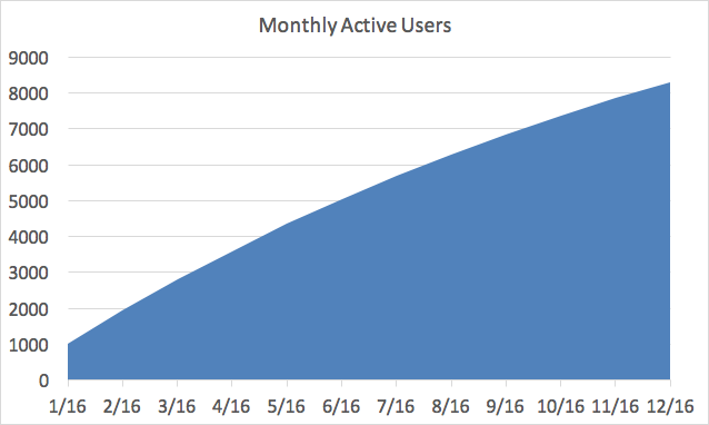
Congrats! You launched a new product to 1,000 users in January of 2016, and have grown it to over 8,000 monthly active users by the end of 2016. Your growth is slowing slightly, but you’re not too worried about it. Why should you be? You grew by 700% in 2016! That’s a cause for celebration.

Lets look at this graph in a slightly different way, by the cohorts of people who start using your product each month. In the example above, I assumed that 1,000 new people sign up for your service each month, and that some of them stop using it over time. Those people might find a different tool, unplug from the internet, or get a virus and blame your tool for the havoc it caused. Either way, of the 1,000 people who start each month, some of them quit using your product in the months after they sign up. This is what the active users chart looks like breaking down the cohorts over time:

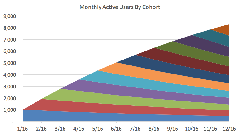
In the chart above, the blue shape on the bottom represents the 1,000 people who signed up in January, and then how many of them are using it throughout the year. By December 2016, only 450 of them are still around. The cohorts “stack” on top of one another to produce your total active users in a given month.

If you develop a great product like Facebook or Uber, there’s some percentage of cohorts that use your product forever. They’re addicted to it. Even if they stop using it at some point, they come back. Facebook would have a hard time growing to 1.6 billion monthly active users if a lot of people used it once or twice and then never used it again.

Let’s see what happens to your growth if you weren’t like Facebook, and you didn’t hang onto your cohorts for a long time like Facebook. Let’s say you continue to have 1,000 people sign up every month, but over time those people end up quitting your product. This is what the chart looks like past 2016:

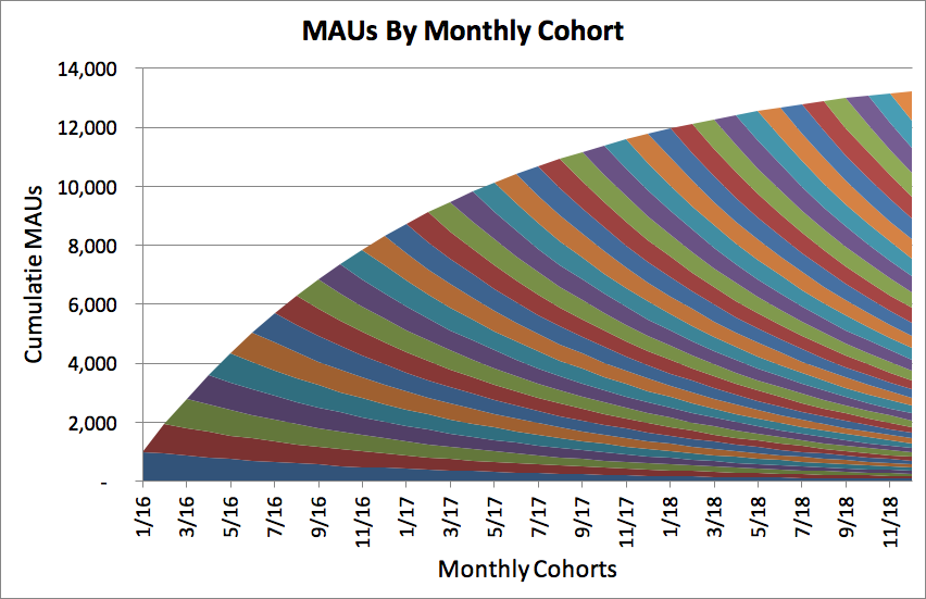
By the end of 2018, you’ll only have 13,000 users of your product. You had 11,700 people at the end of 2017! Even though you grew 700% in 2016, you only grew 11% in 2018. The rate at which you’re growing is slowing significantly, even though you continue to add 1,000 users a month. You can see this visually in the bottom right of the chart, where all of the cohorts seem to stack on top of one another, but don’t add up to anything. You can’t even tell the cohorts apart, they just look like a colorful set of stripes. By the end of 2018, the new people you’re adding every month are barely replacing the people who abandon your product from all of your previous cohorts.

What does it look like if you are able to build a product where 50% of your cohorts end up loving you product and sticking around for a long time. What would that look like? Let’s update our graphs:

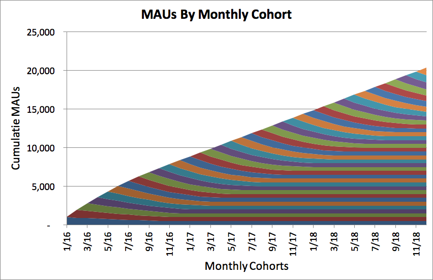
Wow! Instead of 13,000 users, you will have 20,000 users by the end of 2018. You can see the big difference between the graphs. In the bottom right you have rectangles that build on top of one another. You overall growth rate is still decreasing (as a percentage of your install base), but your total number of active users continues to increase. In the previous example your growth had basically stalled, in this graph you are growing at a constant rate. The best products in the world retain a large percentage of cohorts over time, and the bars are a large percentage of the initial cohort size.

Up until this point, I’ve only been talking about retention of users. If you’re running a business you ultimately need to charge for your service (for example, a monthly subscription). Assume that a percentage of people will end up paying for your service, and that they slowly upgrade over time. If you can forecast how many people will be using your product, you should also be able to project how much money you’ll be making. Lets look at what your revenue looks like (again, broken down by cohort) when you have poor retention:

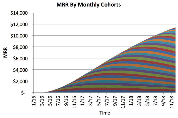
As your cohort sizes go to nothing, those people won’t keep paying for your product. This graph doesn’t look too bad, but what about if you look further into the future?

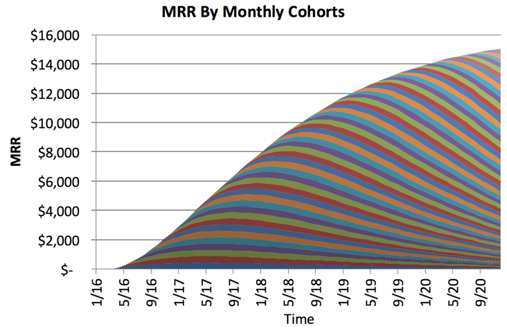
That doesn’t look good, you’re barely making any more money two years later. What about in the case where you have good retention? Assume that 10% of the long term users end up paying for your product, and they pay $50 / month. They don’t immediately upgrade — it happens slowly over time. What would that graph look like?

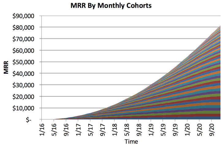
Holy crap! I like the slope of that line. In the bad retention example, you are making $15,000 / month in recurring revenue. What about in the good retention example? Over $80,000 / month.

Interested in playing with the different scenarios yourself? I uploaded my hypothetical data in an Excel file here, or in a Google Spreadsheet here. Google Spreadsheets is crappy for this kind of stuff, I’d recommend using Excel.

Predicting the future, one week at a time

I used to be the PM for one of HubSpot’s freemium email tools. It was a great experience launching something brand new in front of thousands of people at our annual conference, and then growing it to hundreds of thousands of active users. We watched our metrics extremely closely, and we knew how fast we had to grow to hit our goal for the next year. I would frequently get questions like “are we having a good week?” and I felt the pressure to give a reliable and accurate projection. If things were going poorly, I needed to be able to understand why and sound the alarm so the team could take action. That said, you can’t have many false alarms. You don’t want to come across as the boy who cried wolf.

I ended up building a simple model in Excel (Google Docs link) that helped me visualize the current week against previous weeks, so I’d be able to make a reasonable guess as to whether we would grow, hold steady, or lose ground.

For example, lets say that 100,000 people used an app on a weekly basis (WAUs). Not every person used it every day, so our DAUs (daily active users) was less than 100,000. Lets say it was 65,000 DAUs. I recorded the cumulative number of people that had used our app so far that week. It looked like this:

WAU_Projection

I then added columns going back in time, and kept track of it going forward. This gave me a nice set of data to play around with:

wau_projection

The pattern of usage each week was incredibly consistent. I graphed each daily total against the final count of users active for that week:

cumulative_percentage

This chart shows that our pattern of usage each week is incredibly consistent. Between 60 and 70 percent of our weekly total uses in Monday, and between 75 and 80 percent of our users have used in by the end of the day Tuesday.

The way I read this chart is that we are better able to predict what our total user count will be by the end of the week. As our user base grows larger, it’s harder for our user acquisition to have as much of an impact. New users can definitely increase, but that’s a good problem to have.

Using these numbers, I updated the model to project what the high and low bounds of what I’d expect for our total usage for the week:

growth_model

Interested in doing this kind of analysis or learning how to build world class products through quantitative analysis? We’re hiring for data analysts at HubSpot, read about the position here.

Disclaimer: all of the data in this sample and the screenshots are fake. They were made up and not reflective of any HubSpot product.

© 2024 Dan Wolchonok

Theme by Anders NorénUp ↑